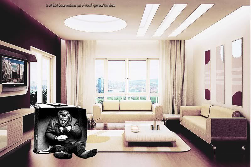
The Poster has been updated slightly with alterations in colours, making the top half of the globe look a bit more inviting with lighter colours and the bottom half darker. Texture has been added to the background, making it more grungey, unfortunately this isnt so visible at this small state. Getting a bit happier with the overall look, I think the composition is about right, not sure if the tagline is strong enough however.
Thoughts appreciated :)


