 Both of these ideas have been Photoshopped up roughly to show a couple of last week's ideas. The colours haven't turned out very good at all when uploading, so please follow the link to Photobucket to see the proper images.
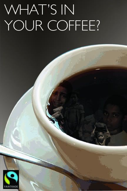
Millions of children aged 5-17 throughout the world still work under a slave-like atmosphere, their main reason to keep their family fed and sheltered. If only people could see what cruel conditions have gone into their normal coffee, or any other everyday imported product, maybe it will make them think differently. Fairtrade offers families a much better income so that their children don't have to work, and can be schooled and treated properly.

Around 218 million people in the world still work earning less than $3US a day. Fairtrade aims to allow artisans / producers to sell their produce direct internationally, so it provides them with a much more stable economy.
6 comments:
Both leave quite a strong message about the issue you are facing and wanting to bring to attention. I do prefer the top image bit more as I feel the image alone is more understandable as to what your wanting to say.
Less than $3 dollars a day is an interesting starting point but the poster doesn't really challenge the viewers.
It could relate to a number of issues and/or points of information - ie. how much the US govt. spends on educating each child in the US of A.
The real issue behind the $3 a day pay is the context you may be able to put it into - if you get the drift.
For example what does $3 dollars a day mean to those workers. Are they being paid so little in order to make big profits for the companies and keep us western consumers happy so we can continue to buy the products produced to satisfy our life styles/needs.
Put it another way - Would you work for $3 dollars a day?
So using a fact (given it is reasonably provable) is a good starting point but it may need moving on beyond a statement of fact to something either a little more informative or challenging.
Remember that posters have to have impact - in a short time viewing period - so may need to have much more impact especially if 'people' do not or are not aware of the conditions many of these people/children work under.
I like the fact that they r clear and seem to give a simple message. i mainly like the one at the bottom, shows the facts, gets you thinking
Thanks for your comment matt
With yours although I like the idea behind the second poster at the moment the first one is the stronger poster.
The composition works really well and in the true colour works effectively. It would be interesting to see if you could do the same idea with something we take for granted e.g water? just a thought
ok maybe not water but a different product, u get the thinking
ok by re-looking at both. the top one, maybe use a bolder type face, and maybe try placing the logo a bit differently not sure how but so that it looks more part of it. (my explaning isnt good sorry). the people in the cup good look to it.
the bottom one. still realy like the style, nice simple clean look. do u need more explanion of what it means? or dose everyone know what it means?
hope that helps
Post a Comment