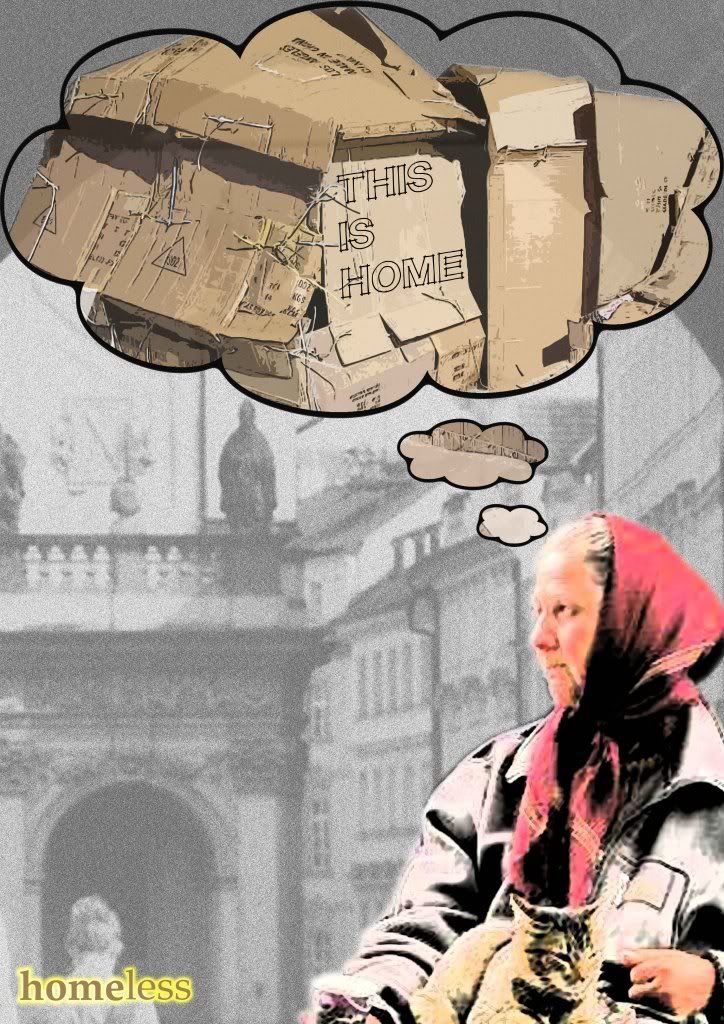
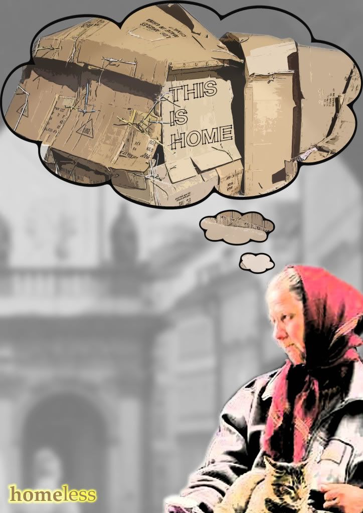
Congratulations to the following Graphic Communication students:
Aneesa Iqbal
Anette Mosdol
Ingrid Velure
Jahmela Anderson
Lotte Andresen
Masomeh Zandi
Matt Hollies
Matt Preston
Paul Power
Rob James
Selina Pal
Following a long conference call yesterday, the international judging panel
decided on the final collection of posters that will form part of an
international travelling exhibition that is scheduled to be exhibited in the
USA, the UK and China.
The judges were full of praise for the standard of entries from all the
student entrants.
The work will initially be seen at Purdue University, USA between September
21 and October 6th, marked with a grand opening, press coverage and a
catalogue.
Judging is still to take place to finalise Prize winners from this
selection.
ALL WINNERS NEED TO CONTACT ME DIRECTLY AS ALL POSTERS NEED TYPOGRAPHY
ADDING IN BOTH ENGLISH AND CHINESE. THIS WILL NECESSITATE SOME REWORKING OF
THE ARTWORK WHICH NEEDS COMPLETING BY THE 20TH OF JULY.
Congratulations to all the student entrants and in particular those chosen
for exhibition. We await the final Prize winners to be decided!
Jeff
Wednesday, 17 June 2009
Monday, 27 April 2009
Wednesday, 1 April 2009
Thank You
A big thanks to all those students who contributed and engaged with the site.
We'll be sending your posters for exhibition and will keep you up to date!
Once again, thanks
We'll be sending your posters for exhibition and will keep you up to date!
Once again, thanks
Sunday, 29 March 2009
CV & LETTER
Friday, 27 March 2009
W A R K I L L S
Thursday, 26 March 2009
'ABUSED' Child Abuse Poster
Police Brutality

My final. I decided that less was more so i only used the hand and the glob. The small paragraph sais that: "Police officers are subject to the same crowd psychology as any other group of armed men and women when in large confrontational groups, and in the grip of fear, anger, or other strong emotion, in encounters whose outcome is uncertain. However, their duty is to enforce the law and PREVENT VIOLENT CONFLICT. They are also provided with deadly weapons, and so have a special responsibility to keep their fear, anger, and similar emotions under control."
Shopping addiction

For most people, it means some new clothes and accessories or a gift to your girlfriend. For others something else, however, shopping is much more than an enjoyable amusement, and in some cases, it is a real and destructive addiction (mentally disease), that can turn into a financial disaster, for you or your family.
In my poster design I visualize an eye that is stare a heroin needle, to show that shopping has crossed the line and become an addiction that need special treatment.
Wednesday, 25 March 2009
more here
Stop Corruption (update)
War and Vanity (attempt 3)
NEW IDEA..hurry hurry!!!no time left!!
please give me feedback!! then i can finish it as soon as prossilbe.
i want to sleep z z Z Z Z..

Brand new idea.tell me what you think,please.
could be the final one ,do u think so?
some other ideas folloed.

The first poster is bese on this idea to develop.
maybe background images are not strong enough?
 I got this idea when i was doing my own CV.share the idea with everybody, hope you gonna like it.

Do remember the previous works i done before?little development after feedback.
i want to sleep z z Z Z Z..

Brand new idea.tell me what you think,please.
could be the final one ,do u think so?
some other ideas folloed.

The first poster is bese on this idea to develop.
maybe background images are not strong enough?
 I got this idea when i was doing my own CV.share the idea with everybody, hope you gonna like it.
Do remember the previous works i done before?little development after feedback.
ENERGYFLO
If anyone is doing the Energyflo logo brief, I'd advise you to take a look at the blog Matt Hollies set up for it - simply so we can interact with each other's ideas from there.
If you haven't been invited and you want to, ask Matt.
Please put comments forward on the work, and your own stuff up. Thanks.
Blue future/ update
Human Rights
Human Rights

This is what I currently have for my Poster, its to represent freedom of torture. I have included the use of a chair, wrapped in barbed wire. The chair is used to symbolize every cultures right. Before human rights was leagalised, only white people were allowed to sit on buses but now everyone has an equal right. The use of the barbed wire wrapped around the chair is to show freedom as its wrapped around an object rather than a person. Will be adding a title aswell
Tuesday, 24 March 2009
HOAX IMPACT - new poster
Blue Planet/Update
Following on from my last design I decided to emphasise the melting of the snowcaps by showing the planet literally melting away.
I also wanted to add a 'heat source' to the backdrop which would represent the heating of the planet.
Do you think text is actually required and which background from these 3 do you prefer?
Thanks

I also wanted to add a 'heat source' to the backdrop which would represent the heating of the planet.
Do you think text is actually required and which background from these 3 do you prefer?
Thanks

Child Abuse
War and Vanity (second attempt)

The idea is to show that there is no symmetry in war and how would we feel if we were scared by by war. This particular person in the photo (my rat brother) is screwing up his face, ripping away his vanity to make himself symmetrical to a country with a lose of vanity.
Poster strap line: WAR, Vanity without a sense of symmetry
Monday, 23 March 2009
War breaks Families
Another Idea (Money Tree)
.jpg) This is another idea for my Money Tree.
This is another idea for my Money Tree.Think it works well with the separation of colour and B&W.
Once again the colour turned funny through uploading.
Governments Tree is full of money where as the Citizens Tree is empty, reflecting on how the government take a lot of peoples money.
Once again I have used Monopoly money due to the fact its stating that money to them is just a game.
I still like my original strapline but dont know whether it would work in this piece!?
feedback please
human right poster
Sunday, 22 March 2009
one bullet, one life [decisions decisions]
Wayde's wildcard xD
Which one to go with? :s
First of all I apologise for the links
and for the quality. I have no reason with the quality has deteriorated this much
My face is hardly visible, but I thought id get it up here for comments on the cropping
and whether the choice to remove was the text was justified.
https://blogger.googleusercontent.com/img/b/R29vZ2xl/AVvXsEjuAYwW3rtdAXkHvcUStt8wQB9td9auxdYEL8XYnS2Ra14IxeICOzjefcdbrg72KU2vcNR6mG4_OG-Ucx2-NgaI2MNbMLOV_A_NxZydbpM-j5ZNU-tXSnanl-yV2pMQSSMh6nopXHUP6n8/s1600-h/test+one.jpg
(the for the link to the original for comparison above)
http://img.photobucket.com/albums/v292/wadexx/Poster/girlmeetsboylandscapeblog.jpg
http://img.photobucket.com/albums/v292/wadexx/Poster/girlmeetsboyblog.jpg
I prefer the landscape but what are your opinions?
Saturday, 21 March 2009
Friday, 20 March 2009
graff
 here is an other poster i was working on. Im not really sure about the idea but i wanted to show that graffiti can be beautifull. as i sed this was only just an other idea but think im going to stick with my poster on oil is blood money.
But if you should have any sujestions i will be truly greatful
cheers
Domestic Violence - which one 2 go 4?
 I have changed the animation image on the TV to make it look more understanding. You can see the fireman is facing at the hoax caller and he looks confused where the real fire in the building is at the back. He missed the chance to save their lives. I have changed the mobile phone into a colour mode to connect with the TV.
 Please comment. :)
recycling update V5
homeless final UPDATED
Subscribe to:
Comments (Atom)


