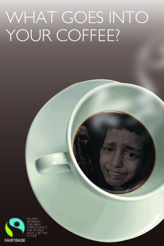
Another design. This time I've really focussed on drawing out the child labour, by adding an overworked, underpaid, crying child - and I'd say this is pretty evident from the image.
Due to my feedback, I've added back the caption and explained what Fairtrade does to alleviate the problem.
If you have any other ideas of how I can show this cruelty without having the caption involved, it would be much appreciated, because I am pretty stuck from hereon.
Thanks,
6 comments:
its really good, really powerful image of the kid. i like how simple it all is. i'm not sure how you could make it work without the quote though.. i think the quote works well. sorry i'm not much help >_< haha
I think the image in the cup is great! I really feel sad when looking at it! Maybe its an idea to put the cup into a breakfast-table environment?
I think this image is much more powerful...the boys look really distressed which is a more shocking angle.
Could you make the image of the boy black and white...maybe the colour looks a little too cheery?
Thanks peeps,
I was thinking of using a wooden coffee shop table - just to give the image a little more depth.
And I will play around with the contrast and opacity of the boy.
I'm glad this image saddens you. My work here is done.
I like the idea of having a more cheery background, with the screaming boy hidden in the coffee.
Perhaps set up your own scene, i.e Photo of coffee on table, in a cafe, people sitting round the table ( so can see their arms on table for example, maybe finger through coffee holder ), flowers on table etc, all from same angle shot you got here.
but then in the Coffee itself, nasty imagery like this?
With the tagline, whats in your coffee, people will still look inside the coffee mug and perhaps be more disturbed when they see this image within what seems quite a happy photo originally.
Did any of that make sense?! lol
i think this is, better powerful with the image of the child, not too sure how to improve, maybe the wite text at the top could be an off white as at the v top may be harder to c from different angles but not much more advice i think its gd.
Post a Comment